
Design Trends That Are Going to Age Terribly.
Your website looks very 2025. In two years, it's going to look very 2025.
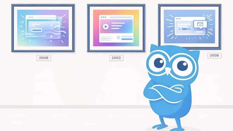
Open your browser right now and visit the websites of five companies in your industry. Odds are good that at least three of them look like they were designed by the same person. Same gradient blobs. Same geometric sans-serif font. Same floating UI elements on a dark background. Same vaguely abstract 3D illustrations.
That’s not a coincidence. It’s trend convergence. And it’s a trap.
Every era of web design has its tells. Glossy buttons and drop shadows screamed 2008. Flat design with geometric illustrations said 2016. Giant hero images with overlay text was peak 2019. And right now, in 2025/2026, we’re living through trends that will look just as dated in a few years. The difference is that right now they feel modern and fresh. Give it 18 months.
The Trends
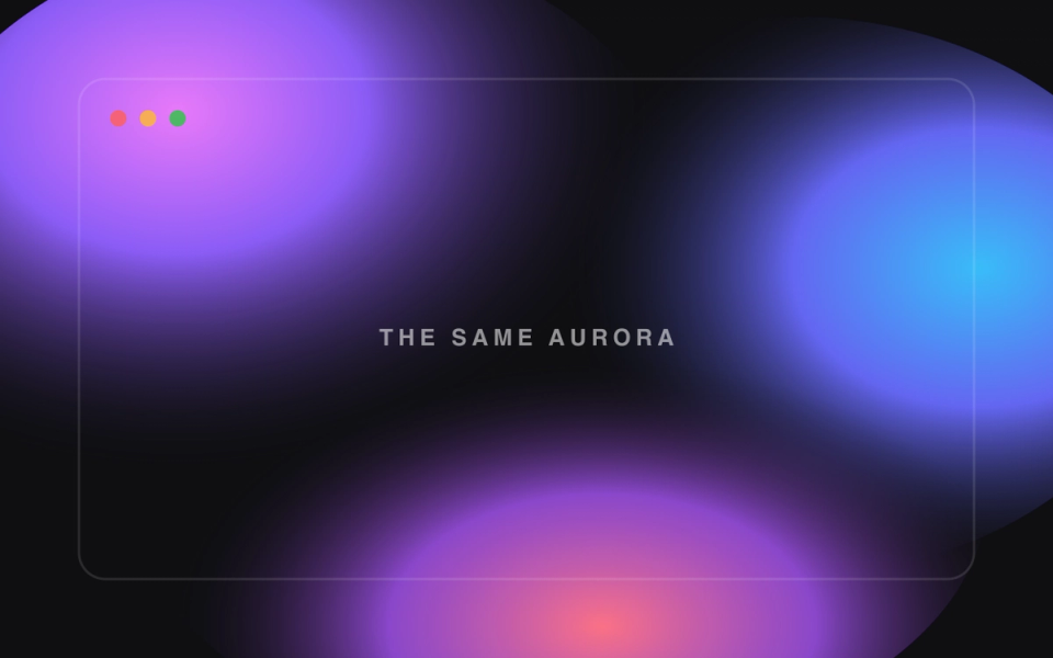
The AI gradient blob
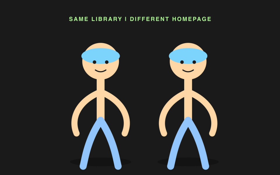
The identical illustration style
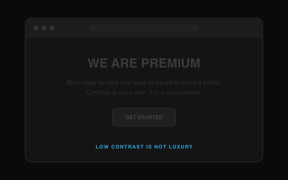
Dark mode everything
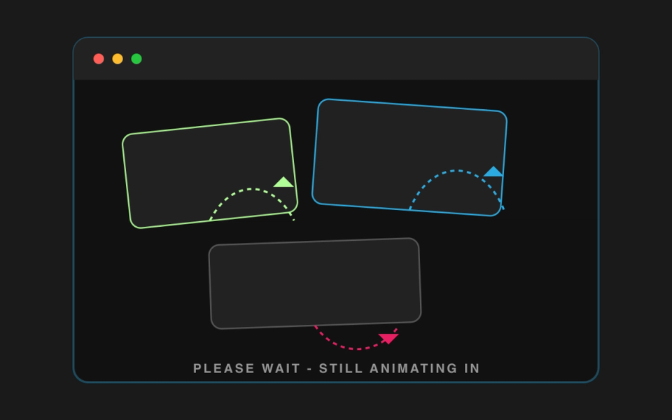
Micro-interactions on everything
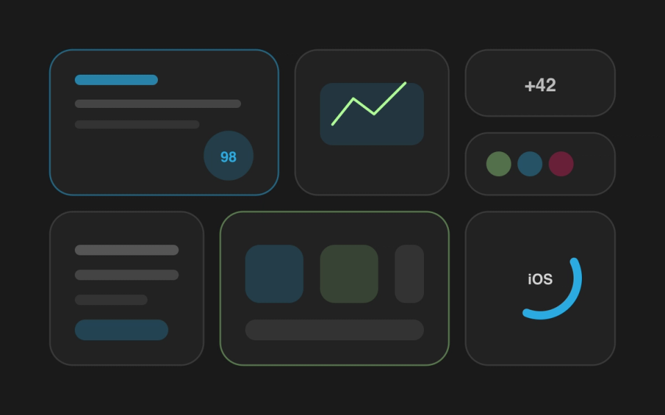
The Bento grid layout
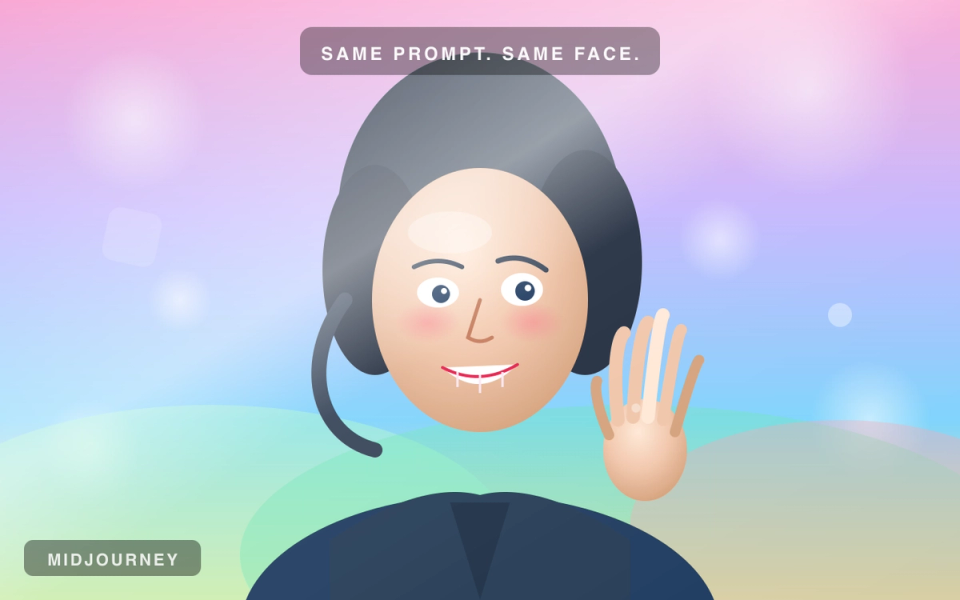
AI-generated hero images
Ages Badly
- Gradient mesh blob backgrounds
- Noodle-arm illustration libraries
- Dark mode for everything
- Excessive micro-interactions on every element
- Bento grid feature layouts
- AI-generated hero images
Ages Well
- Strong typographic hierarchy
- Original brand-specific photography
- Intentional, strategy-driven color palettes
- Purposeful animation that guides attention
- Clean layouts that prioritize readability
- Custom illustration with a distinct style
Why Trends Are Seductive
Trends feel safe. But early adopters stood out because the trend was fresh. By the time you copy it, it’s background noise. You’re fitting in, not standing out.
If your website could belong to any company in your space, it’s not good design. It’s fashion. And fashion expires.
The Trend Test
Ask: Would this make sense if nobody else did it? Does it serve your audience? Will it hold up in three years? If not, you’re building with an expiration date.
What Ages Well
Clean typography. Generous whitespace. Content hierarchy that makes sense. Photography that’s specific to your brand, not stock. Color choices that reflect who you are, not what’s trending on Dribbble.
The sites that still look good five years later are the ones where every design decision was made for a reason, not because it was popular.
Here’s what actually holds up: Strong typographic systems with clear hierarchy. Original photography or illustration specific to your brand. Intentional color palettes rooted in strategy. Simple, logical layouts that prioritize readability. And performance — a fast site always feels more modern than a slow, over-designed one.
At Kahoots, this is how we approach every web design project. We draw inspiration from what’s current, but we build around what’s lasting. The goal is a site that still feels right in 2028, not one that screams 2025.
The Real Question
Does your website look like your brand? Or does it look like everyone else’s brand in 2025? If it could belong to any company in your space, it’s not good design. It’s fashion. And fashion expires.
The best design doesn’t call attention to itself. It calls attention to the message, the product, the experience. If someone visits your site and thinks “what a cool design,” that’s nice. If they think “I understand exactly what this company does and I want to learn more” — that’s effective design. Those two things aren’t the same. Chasing trends optimizes for the first at the expense of the second.