
10 Web Design Trends That Actually Matter in 2026
The trends worth paying attention to aren’t cosmetic. They’re structural. Here’s what separates sites that perform from sites that just look fine.

Every year the internet fills up with trend roundups featuring glassmorphism, neubrutalism, and whatever visual fad just hit Dribbble. Most of it is decoration. The trends that actually determine whether your site ranks, converts, and survives the next three years are structural—how it’s built, how it’s found, and whether it works for the people who land on it. Here are the 10 that matter.
1. Bold, Oversized Typography as the Hero Element
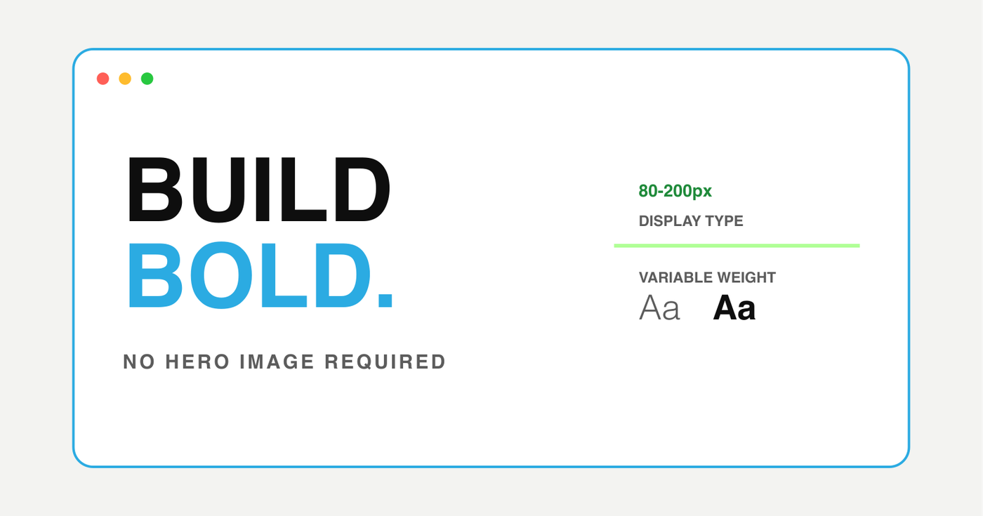
Giant display type is replacing hero images as the primary visual anchor. Instead of a full-bleed photo with text overlay, the best sites in 2026 use massive, expressive headlines—often 80–200px—as the hero itself. The text IS the design.
- Display fonts at 5–15vw that scale fluidly across devices
- Variable fonts with weight and width animations on scroll or hover
- Mixed-weight headlines where one word is black weight and the rest is light
- Kinetic type that responds to cursor movement or scroll position
2. AI-Ready Content Architecture
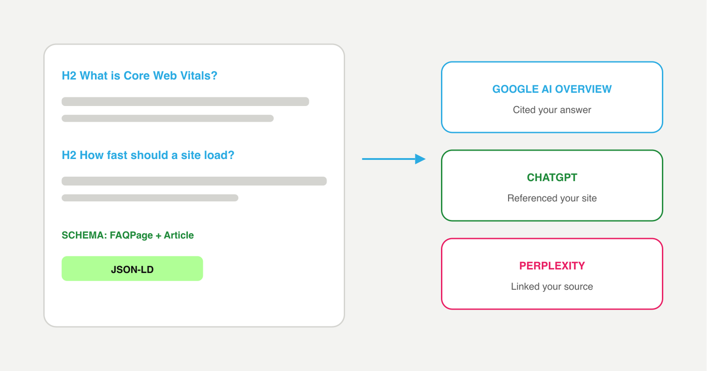
Google AI Overviews, ChatGPT, and Perplexity now pull answers directly from websites and cite them. Sites structured for AI extraction are getting free traffic that used to require paid ads. Sites without structure are becoming invisible.
- Question-based H2 headings that match real search queries
- Direct answers in the first sentence of each section
- FAQPage, Article, LocalBusiness, and Service schema markup
- Semantic HTML with proper heading hierarchy (H1 → H2 → H3)
- Named entities (people, companies, products) that AI can reference
3. Dark Mode and Adaptive Color Systems
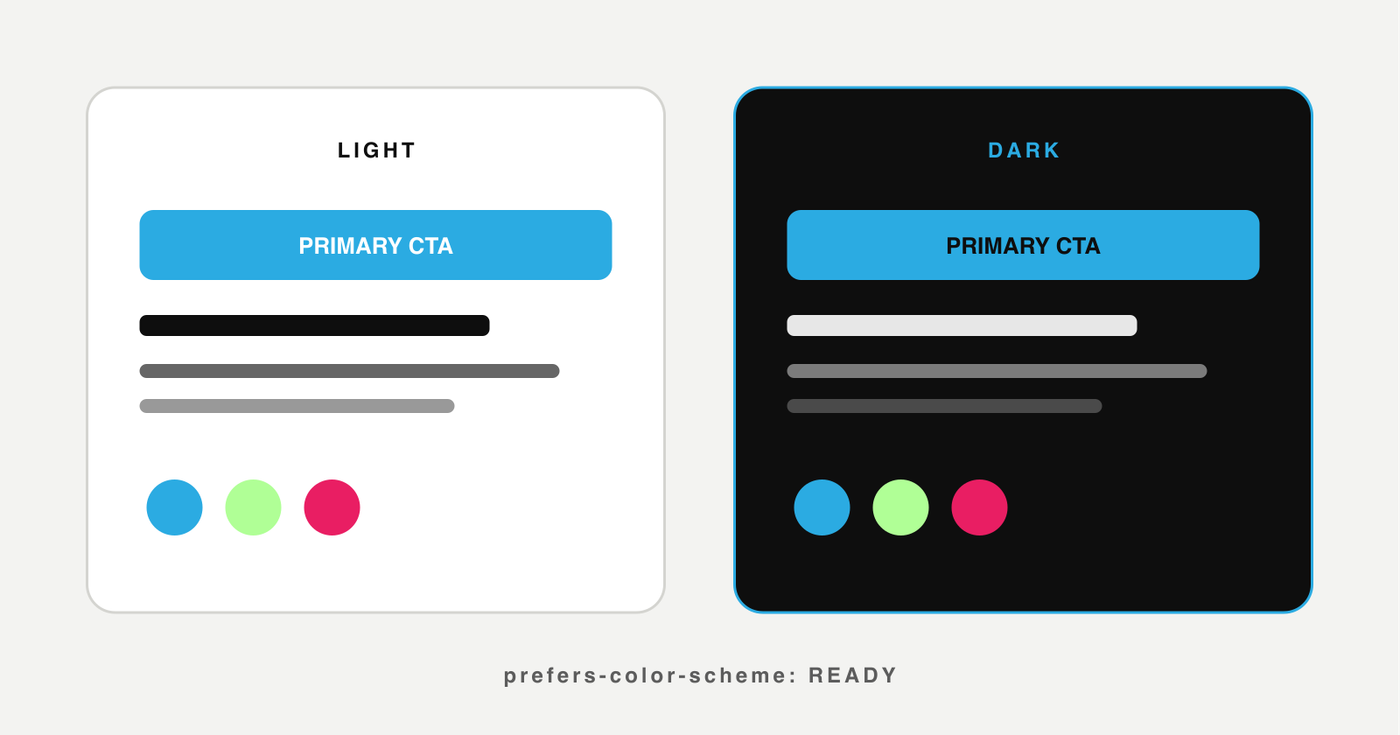
Dark mode is no longer a toggle buried in settings—it’s a first-class design consideration. The best sites detect user preference via prefers-color-scheme and serve an optimized dark palette automatically. Beyond dark mode, adaptive color systems use CSS custom properties to create entire theme layers that shift based on context.
- Automatic dark/light mode based on OS preference
- CSS custom properties for theme-wide color tokens
- Reduced brightness in dark mode (not just inverted colors)
- Brand colors that work on both light and dark backgrounds
4. Micro-Interactions and Scroll-Driven Animation
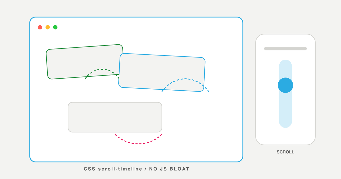
Subtle motion design is replacing heavy animation libraries. The CSS scroll-timeline API now allows scroll-driven animations without JavaScript. Well-designed micro-interactions—button state changes, hover reveals, loading transitions—make interfaces feel responsive and intentional without the performance cost of animation frameworks.
- CSS scroll-timeline for parallax and reveal effects without JS
- Cursor-driven hover states that respond to position, not just presence
- Skeleton loading screens that feel intentional, not broken
- Transition choreography—elements animate in coordinated sequences, not all at once
5. Performance-First Design
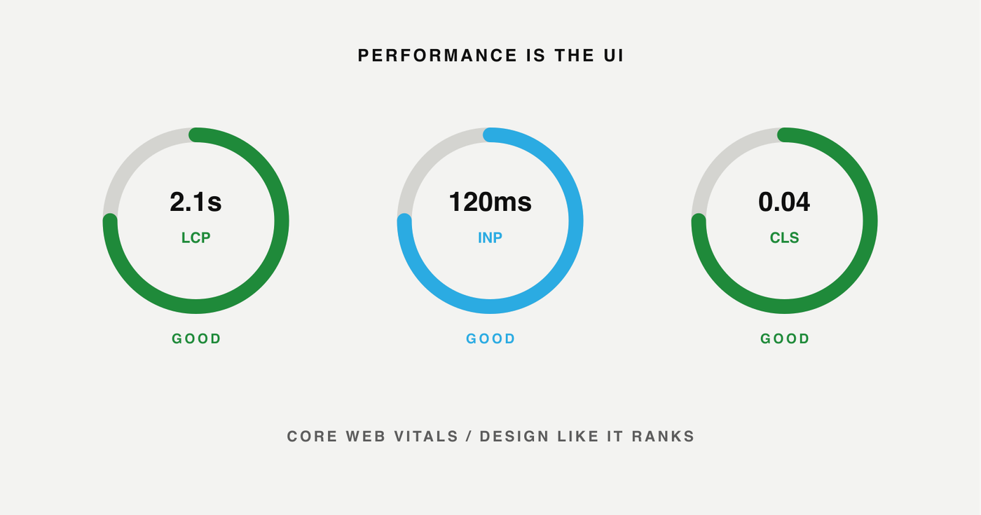
Core Web Vitals are a confirmed ranking factor, and the bar keeps rising. In 2026, a “fast” website loads its largest content element (LCP) in under 2.5 seconds, responds to input (INP) in under 200 milliseconds, and maintains visual stability (CLS near zero). These are design decisions, not just developer concerns.
- AVIF and WebP images instead of PNG/JPEG (40–70% smaller)
- System font stacks or variable fonts instead of loading 4+ font files
- Lazy loading for everything below the fold
- No third-party scripts until after page load (defer analytics, chat widgets)
- Code splitting so users only download the page they’re visiting
6. Bento Grid Layouts
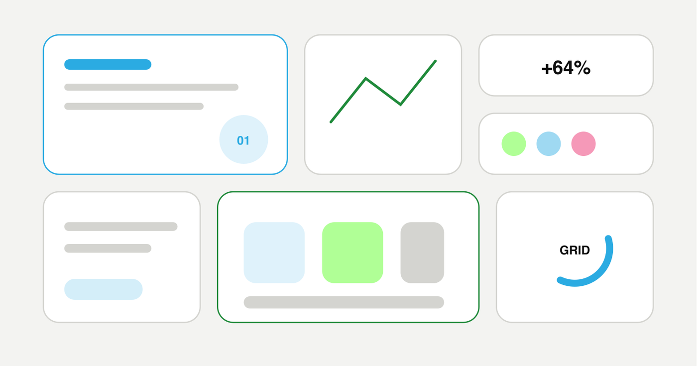
The bento grid—named after Japanese bento boxes—uses cards of varying sizes arranged in a tight, asymmetrical grid. It’s replaced the uniform card grid as the dominant layout for features, services, and portfolio sections. The layout creates visual hierarchy naturally by letting important items take more space.
- CSS Grid with grid-template-areas for semantic, named regions
- Cards of varying heights and widths that create visual rhythm
- Content density—more information per viewport without feeling cluttered
- Works naturally on mobile by collapsing into a single column
7. Accessibility-First Design
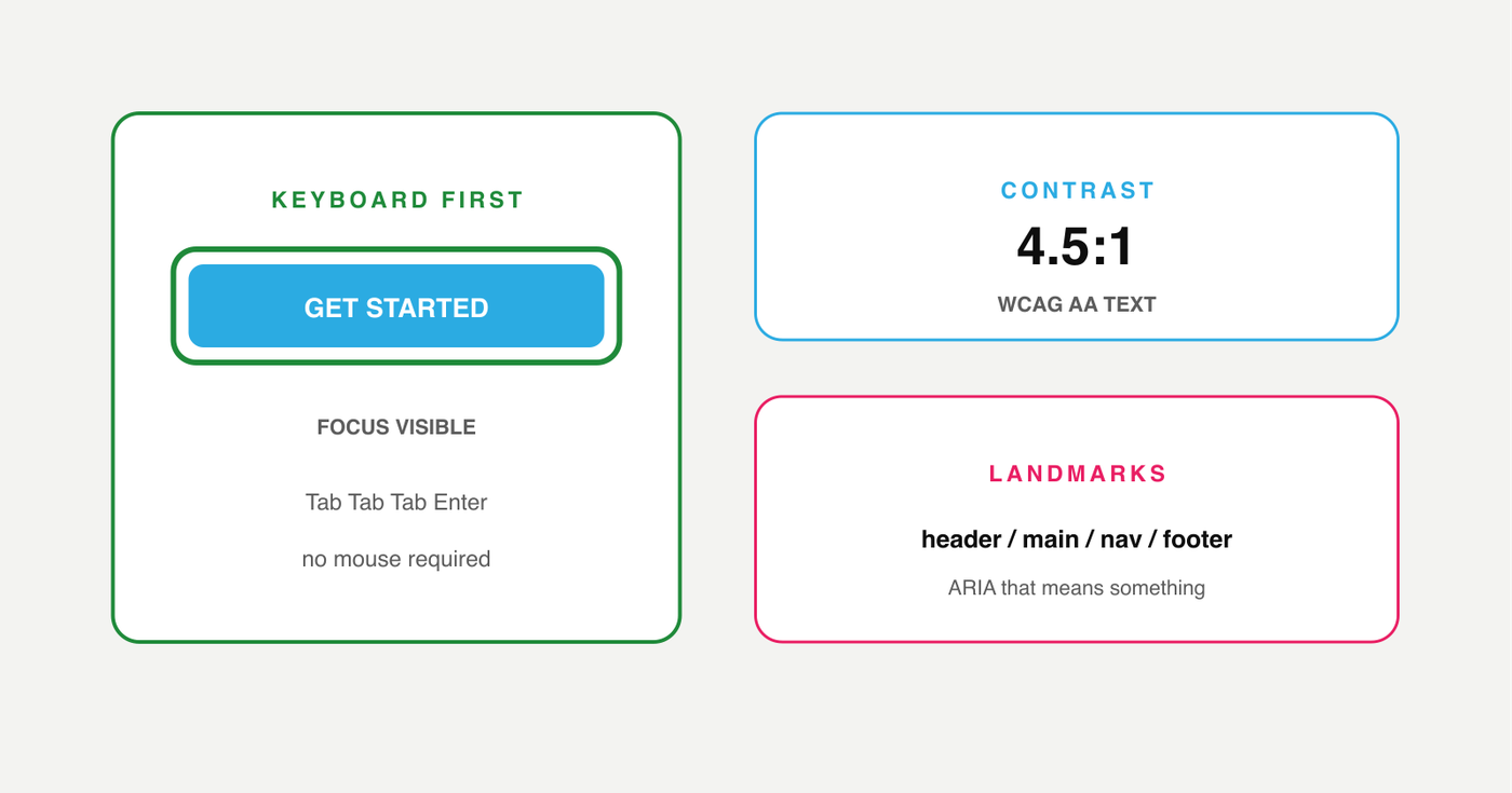
Accessibility has moved from compliance checkbox to design philosophy. ADA lawsuits have increased every year since 2020, and the DOJ has made clear that websites are covered. But beyond legal risk—accessible sites rank higher, load faster, and work better for everyone.
- Keyboard navigation that works without a mouse
- Color contrast ratios meeting WCAG AA (4.5:1 for text, 3:1 for large text)
- Focus indicators visible on every interactive element
- Screen reader-friendly ARIA labels and landmark roles
- No overlay widgets—they don’t fix underlying issues and often make things worse
8. The Human-Made Premium
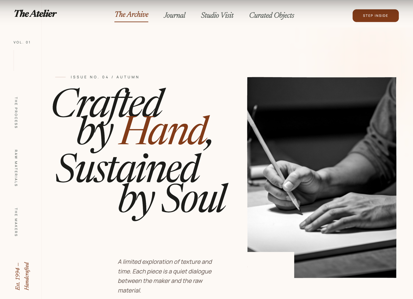
AI-generated websites are flooding the market with identical layouts, stock illustrations, and copy that reads like a prompt. The counter-trend: businesses are paying a premium for sites that look and feel obviously human-made. Custom illustration, hand-crafted typography systems, brand-specific design languages, and editorial content voice are the new differentiators.
- Custom visual systems instead of template-based design kits
- Brand-specific illustration style (not generic AI-generated images)
- Editorial voice in UI copy—buttons, labels, and microcopy that sound like a person
- Intentional imperfection—slight rotations, hand-drawn accents, organic shapes
9. Mobile-First Is Table Stakes
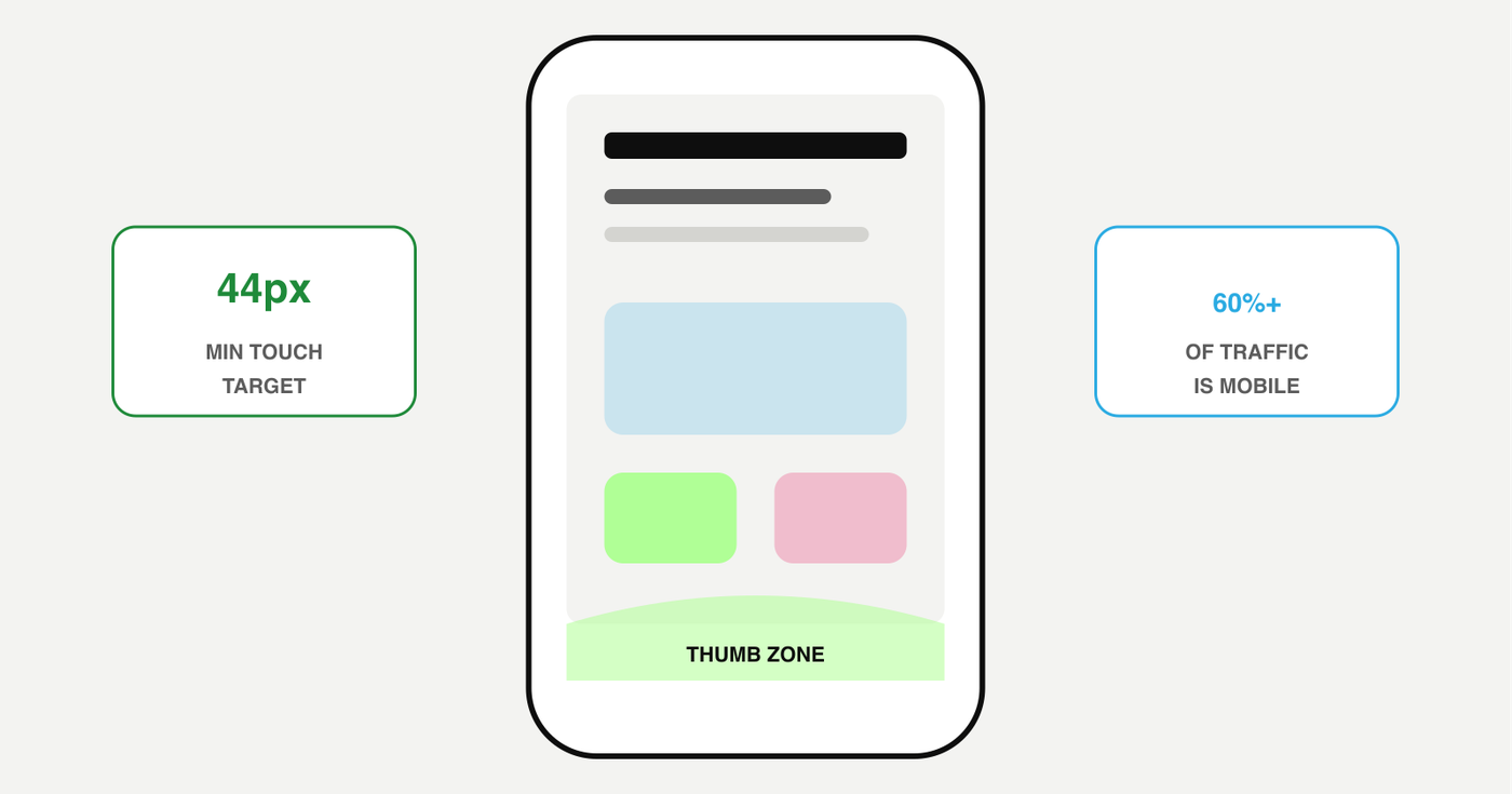
Over 60% of web traffic comes from mobile devices, and Google uses mobile-first indexing exclusively. Designing desktop-first and adapting down is a fundamental mistake in 2026. The best sites are designed for the smallest screen first, then progressively enhanced for larger viewports.
- Touch targets minimum 44×44px (Apple HIG) or 48×48px (Material)
- Navigation designed for thumb reach, not mouse hover
- Content hierarchy prioritized for vertical scroll, not wide layouts
- Images served at device-appropriate resolutions with srcset
10. Structured Data Everywhere
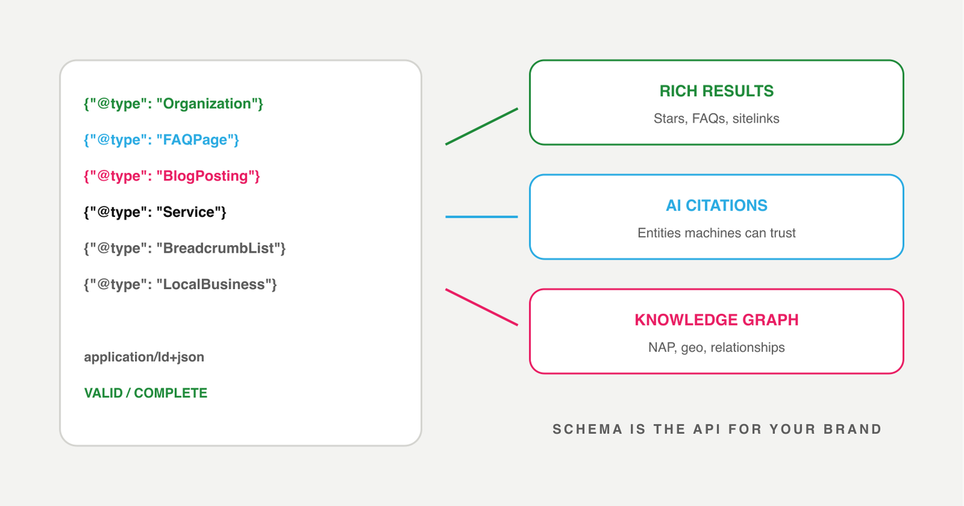
Schema markup is no longer optional SEO housekeeping—it’s the interface between your website and every AI system that reads it. In 2026, sites with comprehensive structured data get rich results in Google, citations in AI answers, and knowledge panel visibility that sites without it simply don’t get.
- Organization and LocalBusiness schema with full NAP and geo coordinates
- FAQPage schema on every page with Q&A content
- BlogPosting schema with named authors and publication dates
- Service schema with area served and price range
- BreadcrumbList schema for site navigation context
What This Means for Your Business
The sites winning in 2026 aren’t the prettiest ones. They’re the ones built with technical precision, content strategy, and a clear understanding of how search and AI discovery actually work.
If your site is more than 3 years old, built on a template, or has never been audited for performance and accessibility, it’s almost certainly costing you traffic, leads, and credibility. The good news: fixing this isn’t about chasing aesthetics. It’s about getting the foundations right—clean code, fast hosting, structured content, proper schema, and design that serves your business goals.
Frequently asked questions
The most important web design trends in 2026 are AI-ready content architecture, performance optimization for Core Web Vitals, accessibility-first design, and mobile-first responsive builds. Cosmetic trends come and go, but these structural foundations determine whether a site ranks, converts, and remains viable long-term.
Most business websites should be redesigned every 3 to 4 years to stay current with technology, design standards, and search engine requirements. Signs you need a redesign sooner include slow load times, declining traffic, poor mobile experience, or outdated security. Regular content updates can extend a site’s life, but the underlying code and UX patterns evolve fast enough that waiting longer than 4 years means falling behind.
Web design is more important than ever because AI-generated sites are flooding the internet with generic, template-based layouts that fail to differentiate brands or convert visitors. Strategic web design—built with real brand thinking, performance optimization, and content architecture for AI search—is the competitive advantage that separates businesses that grow from businesses that blend in.
A high-performing website in 2026 loads its largest content element in under 2.5 seconds, uses semantic HTML with structured data and schema markup, is fully accessible, and is built mobile-first. Performance is not just about speed—it includes content structure that AI search tools can parse, proper heading hierarchy, and clean code that scales without technical debt.